


How to Decorate with Red at Home Without Overwhelming the Room
To decorate with red successfully, choose deep, earthy shades over bright red, use it in a few focused pieces, and pair it with texture and calm neutrals.
By Maya Sheinberger | 14.02.26
Around Valentine's Day, red is everywhere: on shop displays, chocolate boxes and every other social media post about "red flags." Yet most of us are nervous about letting it move in for good. We worry it will feel loud, look cheap or give us a headache within a month, so we cross it off the palette entirely. That's a pity, because the right red can make a room feel warm, confident and alive.
Key takeaways
Skip bright, glossy red and choose complex shades like rust, terracotta, wine and burgundy.
Use red as a focal point, in one armchair, rug, artwork or cabinet, rather than on four walls.
Texture softens red: velvet, wool, linen and leather make it feel richer.
Balance it with gray, concrete, white or natural wood.
Which shade of red should you choose?
Shade | Feels like | Pairs well with |
Rust and terracotta | Earthy, warm, relaxed | Linen, oak, white plaster |
Wine and burgundy | Deep, elegant, enveloping | Walnut, brass, gray |
Brick red | Grounded, slightly rustic | Concrete, black metal, wool |
Bright primary red | Loud, commercial | Use only in very small touches |
Choose a red with depth
The biggest reason red looks like a design mistake is the shade. The bright, shiny red we know from packaging and cheap flyers almost always reads as plastic. A red with a little brown, black or even purple in it feels steady and timeless instead. Rust and wine-red shades don't shout. They add a layer of depth that sits comfortably with natural materials.

In the N apartment, the red appears as a rust-colored headboard and a tall red-brown cabinet. Both are warm, earthy shades, and both sit against plenty of white, so the color feels intentional rather than overwhelming.
Decorate with red as an accent, not a background
Red isn't a color for all four walls. Think of it as a strong spice: the dose is what separates a great dish from a disaster. The safest way to bring it home is through a few pieces that become focal points. That could be a single armchair in a good fabric, a traditional rug, a bold artwork on a white wall, or the inside of a cabinet that only shows when you open it. The aim is to give a neutral room character without letting the color take over.
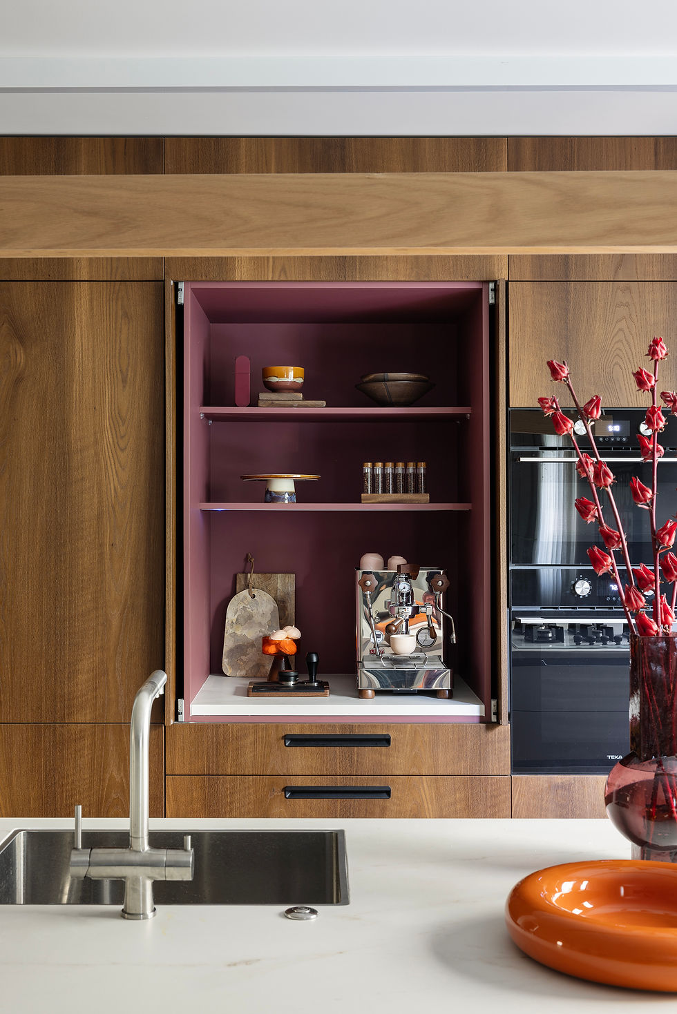
In the OA apartment, the red is tucked inside the joinery: a deep burgundy coffee cabinet within warm oak, picked up again by red branches on the island. It's a surprise rather than a statement, and that's exactly why it works.
Texture comes before color
Texture is one of the best tools for refining red. On a smooth, glossy surface, red almost always looks industrial or toy-like. On a rich texture, the effect changes completely. Red velvet catches light and shadow, which softens the color and makes it feel luxurious. Wool, linen or leather in clay and brick tones feel warm and lived-in. When the color sinks into a natural material, it loses its aggression.
Balance it with calm partners
To stop red from becoming visual noise, give it partners that calm it down. Gray and concrete are the classic choice, because their coolness balances red's heat. Natural wood is another, especially oak or walnut, which makes red feel more organic and grown-up. White walls give it space, and a calm base lets one red piece stand out. For more on keeping a room warm and calm at the same time, see my guide to a minimalist home that doesn't lose its warmth.
Where to use red in each room
Living room: one armchair, a rug or a large artwork. Keep the sofa neutral.
Bedroom: a headboard, a throw or curtains in rust or wine, which feel warm in the evening light.
Kitchen: the inside of a cabinet, a few stools or a ceramic collection on an open shelf, rather than the fronts.
Entrance: a painted door, a vintage rug or a single framed print that greets you as you come in.
Whichever room you choose, start with one piece and live with it for a few weeks before adding more. If you're buying a red armchair or sofa, my guide to choosing furniture will help you check the fabric and proportions first.
Frequently asked questions
Is red a good color for a living room?
Yes, as an accent. A red armchair, rug, artwork or cushion can bring warmth to a living room, while a neutral background keeps it calm.
What colors go well with red in interior design?
Gray, concrete, white and natural wood tones like oak and walnut all balance red. Black metal and brass also work with deeper shades.
Can I use red in a bedroom?
Yes. Deep shades such as rust or burgundy on a headboard, a throw or curtains feel warm and enveloping. Avoid bright red on large surfaces.
Which red is the most timeless?
Shades with some brown or black in them, such as rust, terracotta, brick and wine, tend to last longer than bright primary red.
How much red is too much?
If red is competing with several other strong colors or covers the walls, it's usually too much. One or two focused red pieces per room are often enough.
Planning a renovation in Tel Aviv or central Israel and want color that lasts? I'd love to hear about your project.
Maya Sheinberger is an interior designer with nearly 20 years of experience. She has run her independent studio since 2012, and it is based in Ramat Gan. She holds a B.Des with honors from the College of Management. Eight of her projects have won Archilovers Best Project awards, her work has appeared in more than 100 publications, and one of her Tel Aviv apartments features in the book The New Minimalist Style.
Photography @itaybenitphotographer · Styling @maya_livnat_harush
This post was inspired by my column on Mako (in Hebrew).


